 SHADOVANCE
Nine ways your documents can look
Every invoice, quote and receipt you send uses one of these. Pick it in Settings, and change it whenever you like.
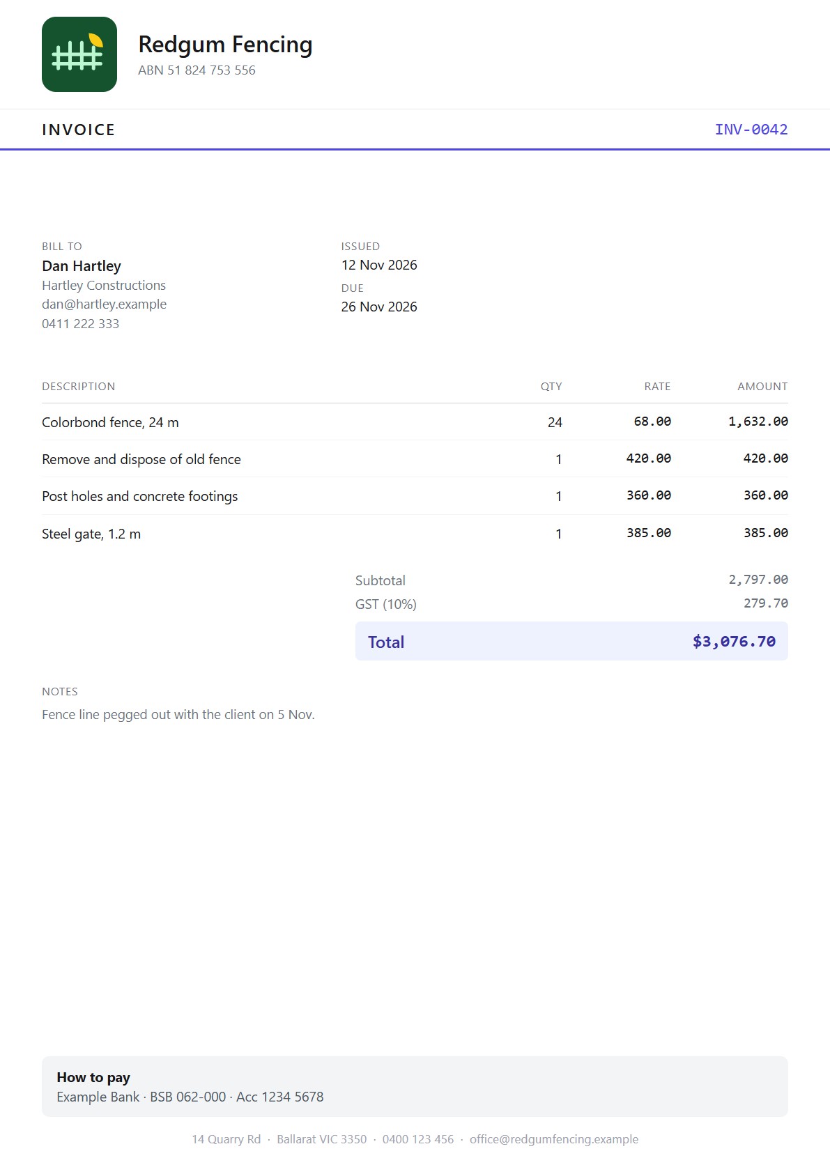
Classic
Familiar and tidy. The default.
Everyone.
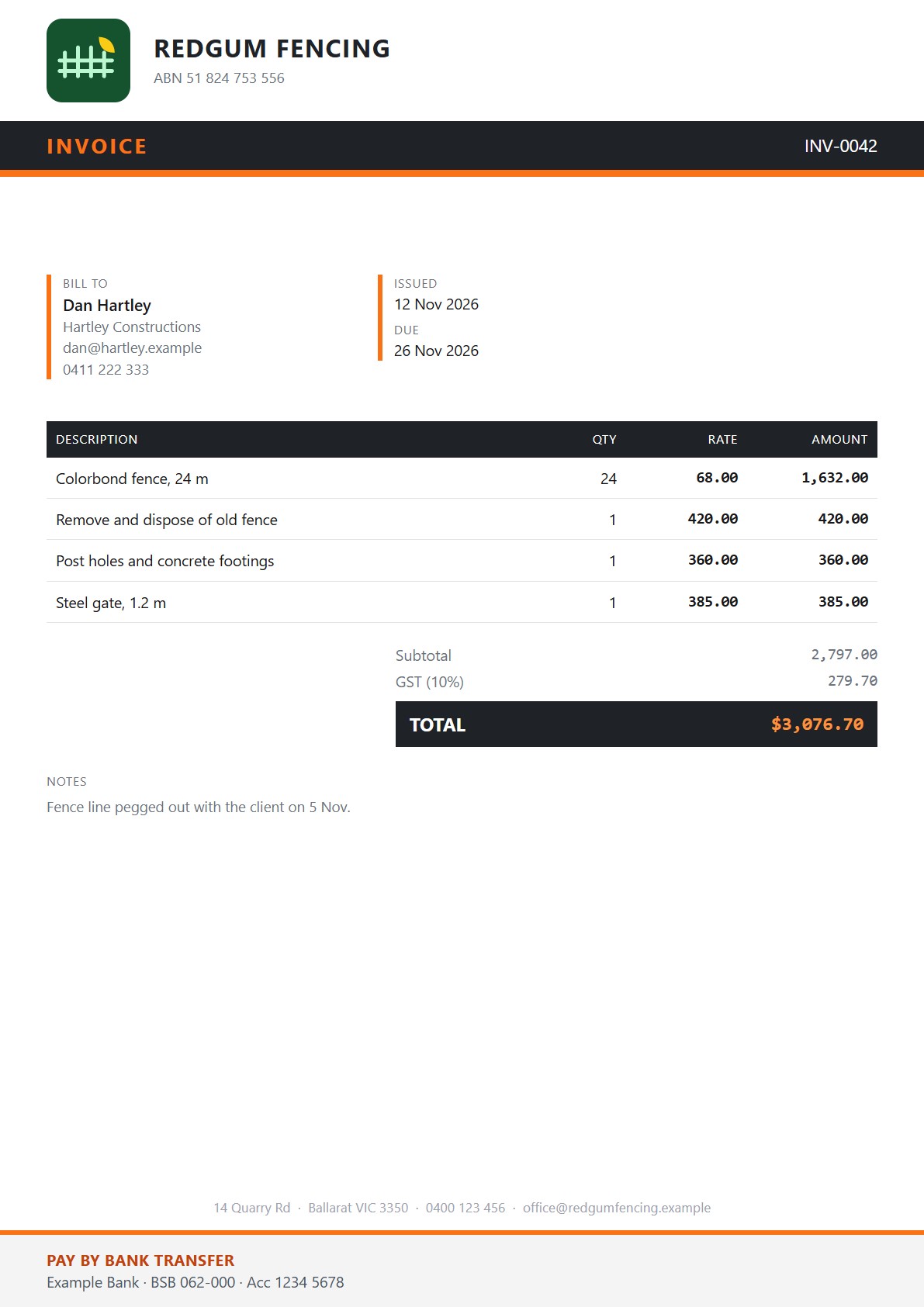
Tradie
Charcoal and safety orange. Solid, no-nonsense.
Good for electricians, plumbers and builders.
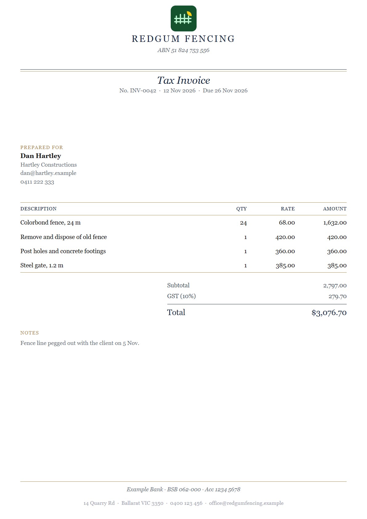
Studio
Navy and gold with a serif letterhead. Polished.
Good for consultants and premium trades.
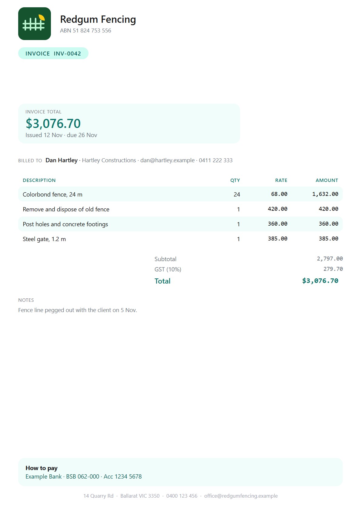
Fresh
Teal with soft rounded cards. Friendly and modern.
Good for cleaners and mobile services.
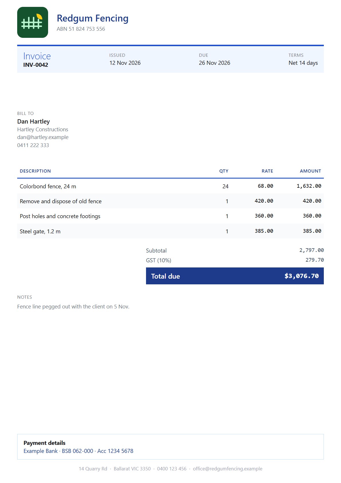
Corporate
Deep blue with a clean grid. Professional.
Good for commercial work and bigger clients.
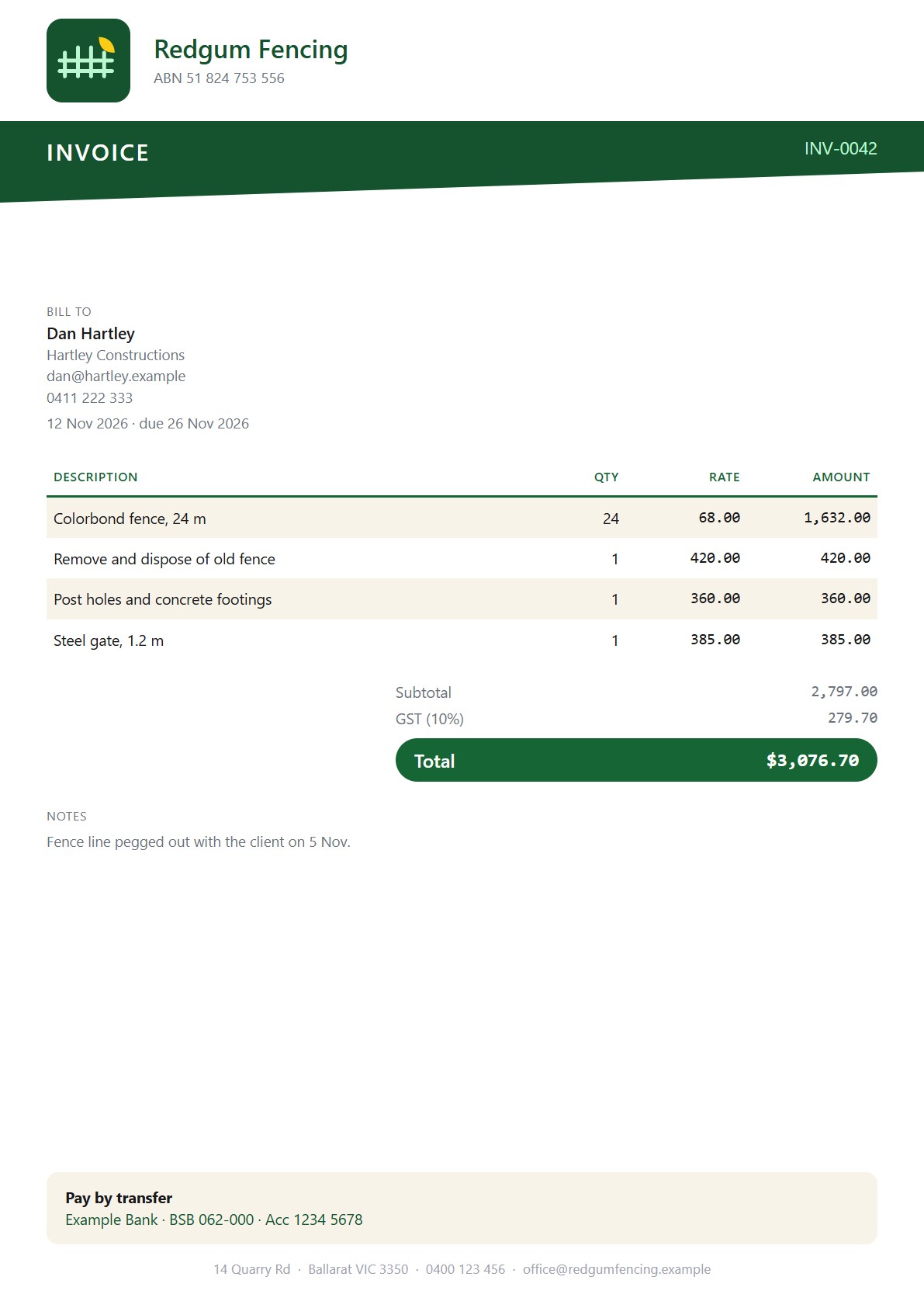
Forest
Deep green with an angled band and sand tones. Earthy.
Good for landscapers and fencing.
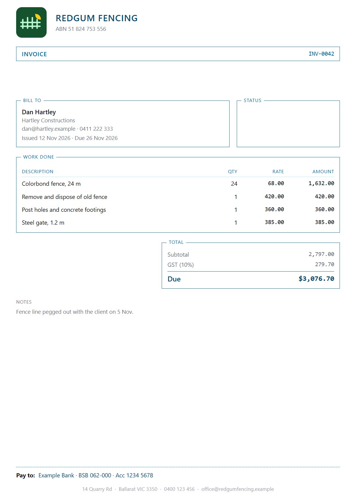
Blueprint
Technical boxed sections in cool blue. Precise.
Good for electrical and technical trades.
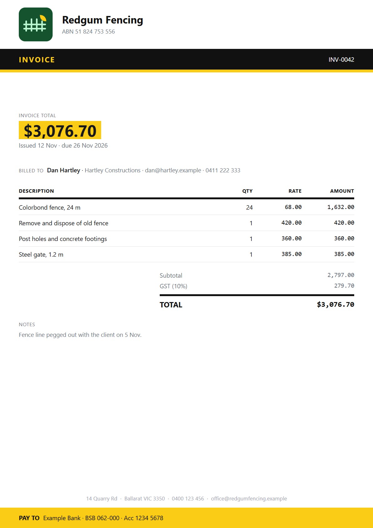
Spark
Black and electric yellow with a big amount. Loud and clear.
Good for anyone who wants to stand out.
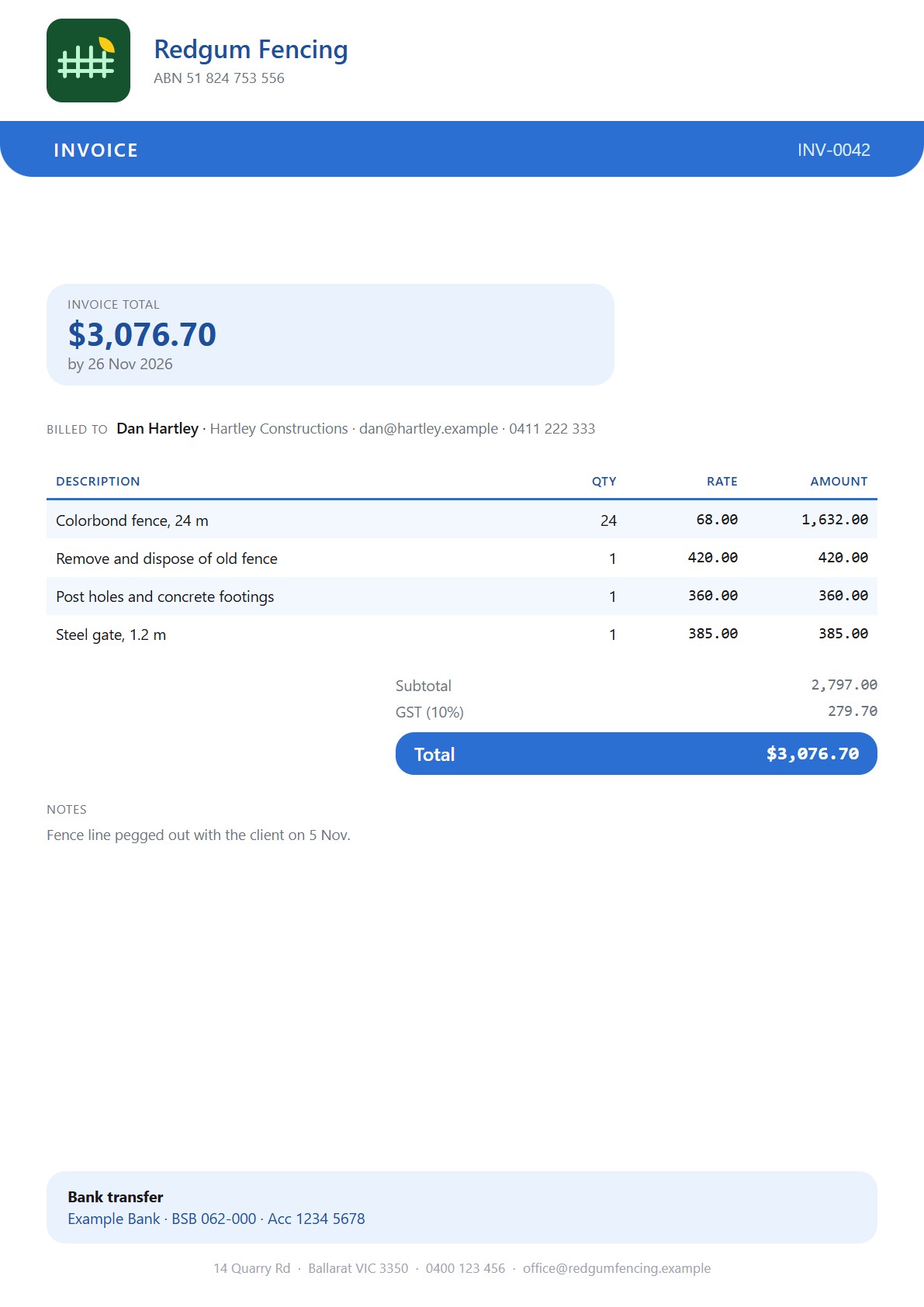
Coastal
Ocean blue with a soft rounded band. Friendly and bright.
Good for friendly service businesses.
Click any document to see it larger. These are samples made with the real app, using a made-up business.
Paid, part paid and overdue
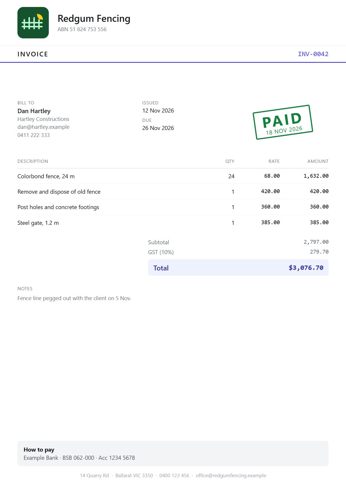
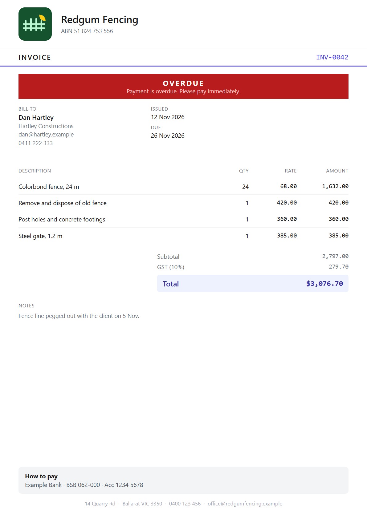
Every style keeps a space free for these, so they never sit on top of your details. A paid invoice gets a PAID stamp with the date. After a part payment the invoice shows what's still owing, and a payment history page is added. An overdue reminder copy gets a red notice under the title.
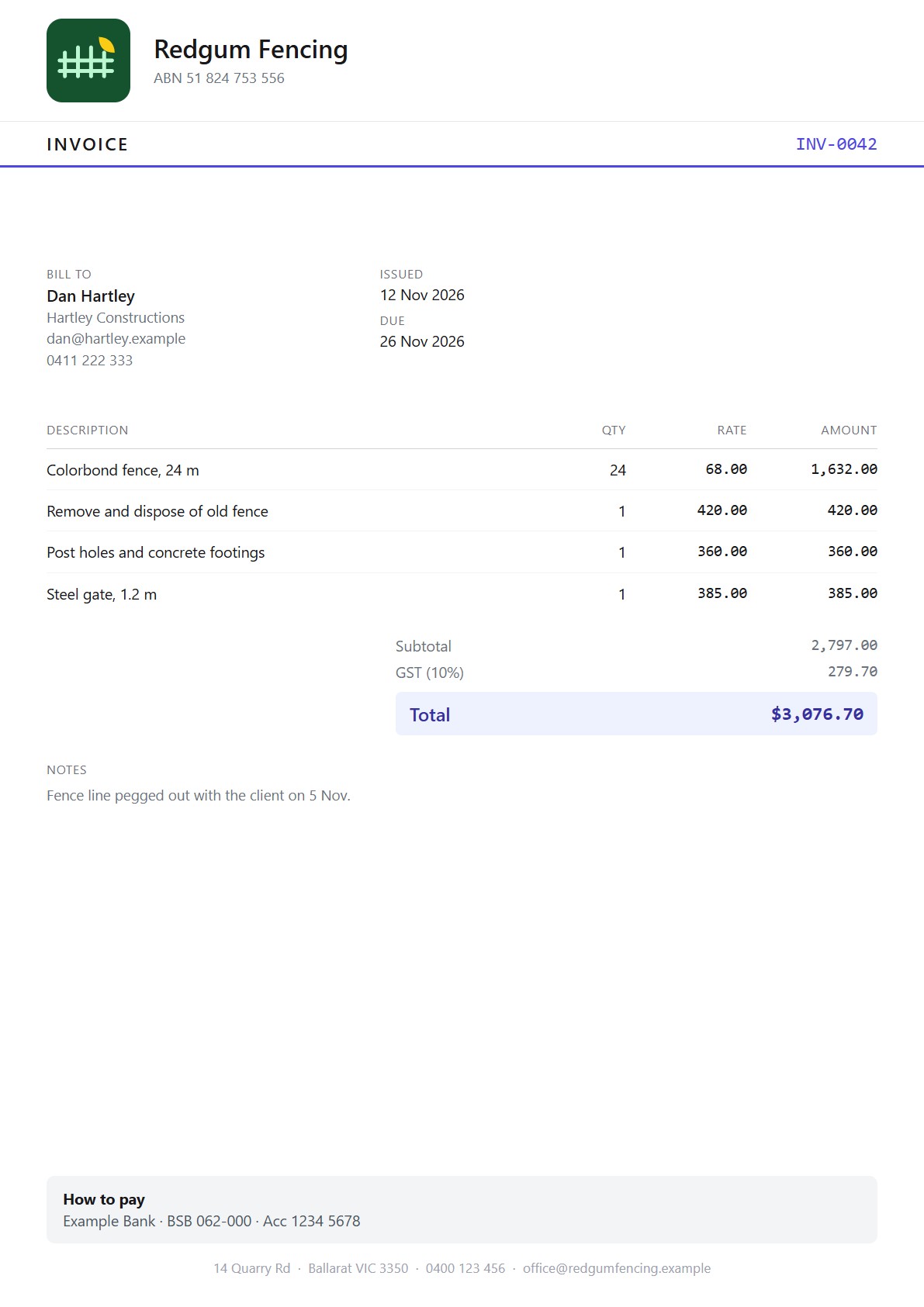
Your logo and name
Square, wide and tall logos all fit without being stretched, and if you have no logo the space closes up. A long business name gets a bit smaller and wraps onto another line instead of being cut off. Documents you've already sent keep the style they were made in, so changing your style only affects new ones.